Actions for Improvement, Vol. I
Things I did between the first drawing and the second to improve my skills.
10/21/20246 min read
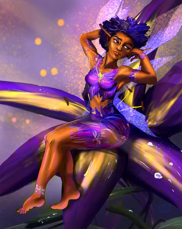
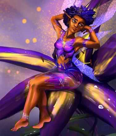
I wanted to document some process improvements that I put into place to level up my art over the past year – I was going to do a top 10 list but it became pretty cumbersome to really describe it all in one post – so I’m breaking it up as a couple of them could use their own post/video. I quickly realized I had way too much commentary for the amount of applicable footage, so the accompanying video may seem a bit disjointed. It’s also my second video with talky bits so I am learning as I create them. Here are some are tips that helped me immensely in the first year:
Using references – if someone tells you using a reference is cheating, be relieved - because you can stop listening to what they have to say. Professionals all use references, and if you want your mind blown look up the Camera Lucida and how the old masters used it. (ZOMG CHEATER!) Your mind’s eye is going to distort reality unless perhaps you are of a neurospicy flavor that can actually code reality into your visual library. I need help with perspective and lighting, so those are two fundamentals that I’m going to need a reference for unless it’s a very basic composition.
Storytelling -- If you are really interested in creating a narrative around your work, you can’t stop at visual references -- so I strive to learn something new about the subject matter I can use to add more detail to a design. When I am drawing fantasy, the anchor to reality is in that accurate detail that’s found in our world that perhaps only a nerd would know about – so I am always researching little factoids about my subject - say how feasible it would be to wear a longsword on your back, do female frogs croak, when were the first eyeglasses made and what did they look like. I think about what tools, materials, resources would have been available to my cultures that live in a certain environment, with specific technology and beliefs. You know, world building. As I’m getting better and faster with my process, I have more time to add these little details to suggest the backstory or the culture my character comes from, making my art a little more fun and interesting to look at to engage my audience’s imagination. I'm just starting to develop this skill, but it's something I am trying hard to stay mindful of and is a goal to incorporate into my work going forward.
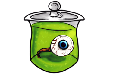
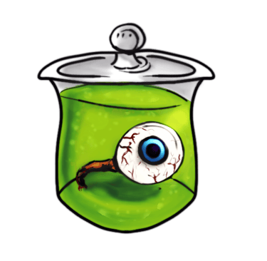
Overusing some digital tools – Many powerful digital tools make images look great, but nothing replaces those art fundamentals. I find that I was overusing the smudge tool, the airbrush, and the burn tool when rendering. The burn tool will make a portion darker, so I would often use it for shadows, and often use it to just darken the outside edges of things. Often you have a core shadow that is inside your form, not on the sides, so it was not convincing and looked terrible on skin. (Unless your character works outside a lot). This coupled with using an overlay layer was creating way too much contrast and blew out any subtlety I had achieved in values. The smudge tool can help blend a small area, but you create artifacts and out of place pixels by overusing it. This is one of the biggest culprits in the dreaded MUDDY look, along with using an indiscriminate airbrush and a terrible color for your shadows. Learning color theory goes a long way, to figure out what colors you should be using for shadows and how saturated they should be. I feel I'm still a beginner when it comes to color theory so I would recommend checking out a lot of videos on it - it's a whole post topic on its own. Think about the kind of ambient light or light source that is in the scene, and what color that is. Also, using a warm reddish tone regardless of skin color on the terminator between light and shadow on my characters was a massive improvement for more realistic looking skin.
Airbrushes are awesome and fun, but overusing them makes everything too soft and very digital looking. To counteract this, make sure you are using some hard edges as well.
Developing edge control separates visual art from a photograph/reality in how the artist guides our eyes towards something with a hard edge; and letting soft or lost edges recede into the background. It helps engage the viewer to complete the story in their own mind without spelling it all out for them.
Freeform select tool/lasso tool is great for creating a hard edge on one side of a shape or plane, and a soft gradient on another. I simply make my selection of an area I want a shadow, texture, hue, and use a soft gradient brush larger than that area, so that the edge of the brush is partly outside my selection. Play around with opacity or try erasing out some of what you painted to try different transitions. Sometimes a nice textured brush as an eraser or as a “topcoat” will help with this. Using the lasso tool will help your speed in simply filling out your canvas.
Silhouette and readability – the overall curations of shapes / shape language of a figure or focal point can get lost when you’re trying to get everything right – anatomy, perspective, values…It’s sad to think a majority of your artwork’s visibility is a teeny thumbnail people are going to blow past as they’re doomscrolling. It’s important to create readability so I often zoom way out and take a look at my figure from across the room. If you just did a paint bucket fill inside your character, how much would you be able to describe about them still? I utilize funky hair strands, tattered clothing, mismatched/asymmetry and variation of size to help create an interesting outline.
I’ve been made more aware of my silhouette when I started using clipping masks over a flat, local color fill of my character. Clipping mask process is certainly its own post, as the concept of masking seems easy to grasp but then when you’re in front of the screen and there’s multiple methods of applying masks, it doesn’t seem as intuitive.
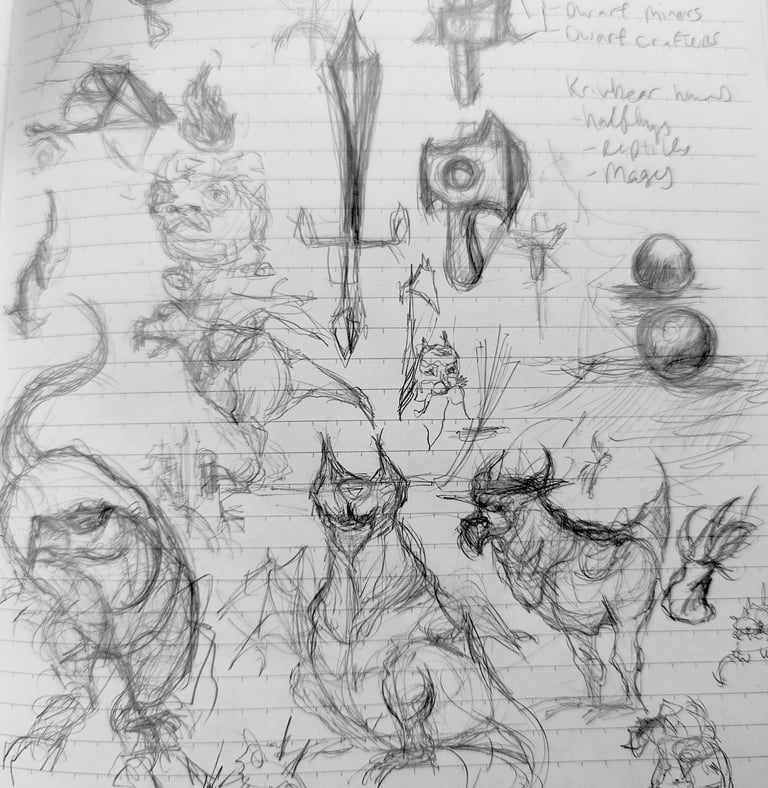
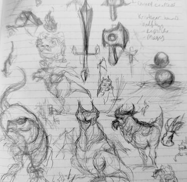
Line quality While most software has some types of stabilization for your lines, your line quality is one of those things that does just take practice – repetition making shapes, connecting lines (and watch your posture you huncher!) – but you can find ways to make practicing fun. I choose goofy subject matter to practice with, like pieces of meat, reptile heads, noses, village huts, etc. I set myself a short time to warm up doodling each day, and I also draw in a sketchbook every day during a quiet time where I’m in the school car line... I’m just drawing weird shapes or body parts in the sketchbook to practice getting my lines to follow forms, experimenting what kind of hatching and accent lines look good and what amount doesn’t make it too busy or indecisive (line economy). I’m constructing shapes that look like they’re moving through space and practicing perspective with quicker, more confident strokes. Line weight is like your primary stat that conveys volume and proximity, so I am often identifying where lines intersect and overlap, and creating a little more weight to suggest where we are in 3d space, trying to identify shadows, and separating objects or materials. It’s a great excuse to study comic art, or to buy books 😊
It’s not Instagram worthy, I scratch my head when I see the trendy sketchbook tours of what looks like finished works to me – mine looks like a middleschool paper bag book cover, complete with a Stussy S.
Probably the single largest (and complicated) process change I made was using clipping masks for my full body character designs. To best describe, I will be making a video just on this process, there are a few different ways to create masks, and it can be harder to implement than the concept is to grasp. (I like the idea of masks more than I like masks). It streamlined many steps, made me not have to sit and wonder what to do next, and really helped keep my work clean.
I'll flesh out some additional tips, and I think it will culminate in a sort of checklist to figure out whether or not a finished, full illustration is "done". Don't let that be overwhelming to you in the beginning - the point is to ENJOY what you are doing, even if you suck at it at first. A lot of bad art is going to be made before you get good, ask me how I know.